Fun with network diagrams!
I’d been meaning to experiment with social network graphs ever since I read Miriam Posner’s post about visualizing movie industry networks using Cytoscape, a network analysis program designed for scientists but (as Miriam demonstrates) equally useful for humanists who want to visualize a network. I finally got around to it a couple of weeks ago, and the results were interesting enough that I thought “hey, I should probably blog about this.”
My first thought was that I could use it to visualize the connections between fictional characters. I wanted to try it with a big, sprawling novel with a big cast of characters, so I chose Bleak House. Putting together the spreadsheet of relationships was the time-consuming part; I suppose you could automate some of it by writing a script to find characters’ names in close proximity to each other, but not only do I not have the skills for that (yet), it probably wouldn’t work too well for the many, many instances where characters aren’t named. And while I got a very nice-looking graph out of it, I’m not sure I learned much: everyone in the novel is connected to everyone else by at least a few degrees, minor characters appear at the edges of the graph, and Esther Summerson is the central character. Not quite as surprising as I’d hoped, though certainly interesting as a test case.*
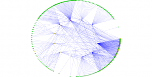
Then it occurred to me that I could use Cytoscape to produce some visualizations for my Potential Book Project. I’ve been slowly assembling a database of poets, poems, commonplace books, and their compilers, and I’d already written a query to tell me which poets were transcribed by which compilers. I pulled the results of that query into a spreadsheet with the compilers in one column and the poets whose work they transcribed in another, ran it through Cytoscape, and started playing with layouts:
This is a circular layout, with the poets in green around the edges and the compilers in the middle. The lines (edges, showing the relationship) radiate outward from compilers to the poets they copied into their books. You can see how some of the poet nodes have a lot of lines going to them and others have only one or two. I like it, but it’s a little confusing in terms of what I was trying to find out (who are the most popular poets? how closely do compilers’ tastes overlap?).
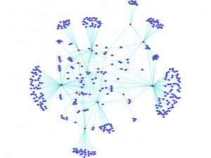
Then I tried a spring-embedded network layout, and suddenly things started making a more intuitive visual sense:
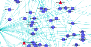
The first image is the whole network, and the second is a detail. Red triangles are compilers; blue circles are poets. You can see the “one-off” poets, the ones cited by only one compiler, clustered at the edges, and the poets cited more than once closer to the center.
Near the middle, in the detail, you can see some of the poets I’ve been finding in commonplace book after commonplace book: Thomas Moore, Byron, Felicia Hemans, Lydia Sigourney, James Montgomery, Sir Walter Scott. It’s still a little hard to see which poets are the most “connected,” but the graph also shows how far apart or close together the compilers are. The red triangle at the far right side of the diagram with the forest of blue nodes attached to it, for instance, is an unnamed compiler from the 1860s and 70s, later than most of the other compilers, who copied a lot of later poets. But she still had a number of poets in common with her earlier predecessors. Meanwhile, compilers who lived relatively close to each other in space and time shared more poets in common, and are visually nearer to each other on the graph.
I doubt if this is the only tool I’ll use to make visual sense out of this project, but it’s been very interesting to explore, and I’m going to keep trying it as the database grows and I have more nodes to add to the network. In the meantime, I think I want to learn more about network theory so I have more than a vague idea of what’s generating those nifty graphs.
* I think this approach could definitely reveal some insights if you tried it with lots and lots of novels and compared them. I have a hunch that 20th-century fiction would generate more social network graphs with isolated little clumps of characters than 19th-century fiction does. (I also suspect that there are lots of novels where you’d get a confusing graph with all the nodes practically in the same place because everyone knows everyone.) I don’t really have the time to pull together all the necessary data, but I bet someone who studies fiction more than I do could have a field day.


Great post and project! I’m a fellow librarian interested in, and just getting started with, network theory and visualizations. My specific research interest is in the meta-fictions of Enrique Vila-Matas and similar 20/21c Spanish and Latin American authors (in English translations), specifically the real and imaginary networks referenced in their works. Anyway, I was wondering if you might want to collaborate and learn along together? (I have no idea what that would look like—probably email correspondence for now?) I recently posted on DH Answers (http://digitalhumanities.org/answers/topic/how-does-one-prepare-and-use-data-for-network-analysis-with-gephi) , am in the middle of learning Python and NLTK (which you hint at in your post), and would love to see more librarians take on these kinds of projects both as PIs and collaborators.
This is quite wonderful. I like how it makes things so easy to apprehend, when they’ve been shifted into a visual rather than purely textual mode. If you continue to explore this, I’d love to hear more about it!